Style
The drive train behind this plugin is its Style options tab. This tab is very powerful and will be explained in detial.
Style tab is separated into six tabs, Card, Image, Content, Text, Social and Skills, respectively.
Card Layout
Layout controls the Card layout. Image and card content can either go as a column or in a row. Here you can set the direction or the gap.
Direction - Sets the direction of the team card. Use Column or Row. If Row option is used additional alignment option is available.
Gap - Sets the gap between image and the team card content.
Card Style
Margin - Sets the margins of the element.
Padding - Sets the paddings of the element.
Border - Sets the border options for the element.
Box shadow - Sets the box shadow options for the element.
Background - Sets the background options for the element.
Background blur - This option is interesting. If the background is transparent, then you can make things blurry in the background. This is a modern effect that achieves nice results easily. Remember to have a transparent background.
Noise - Noise is also a modern element. Use noise to add overlay of noise pattern over your team cards.
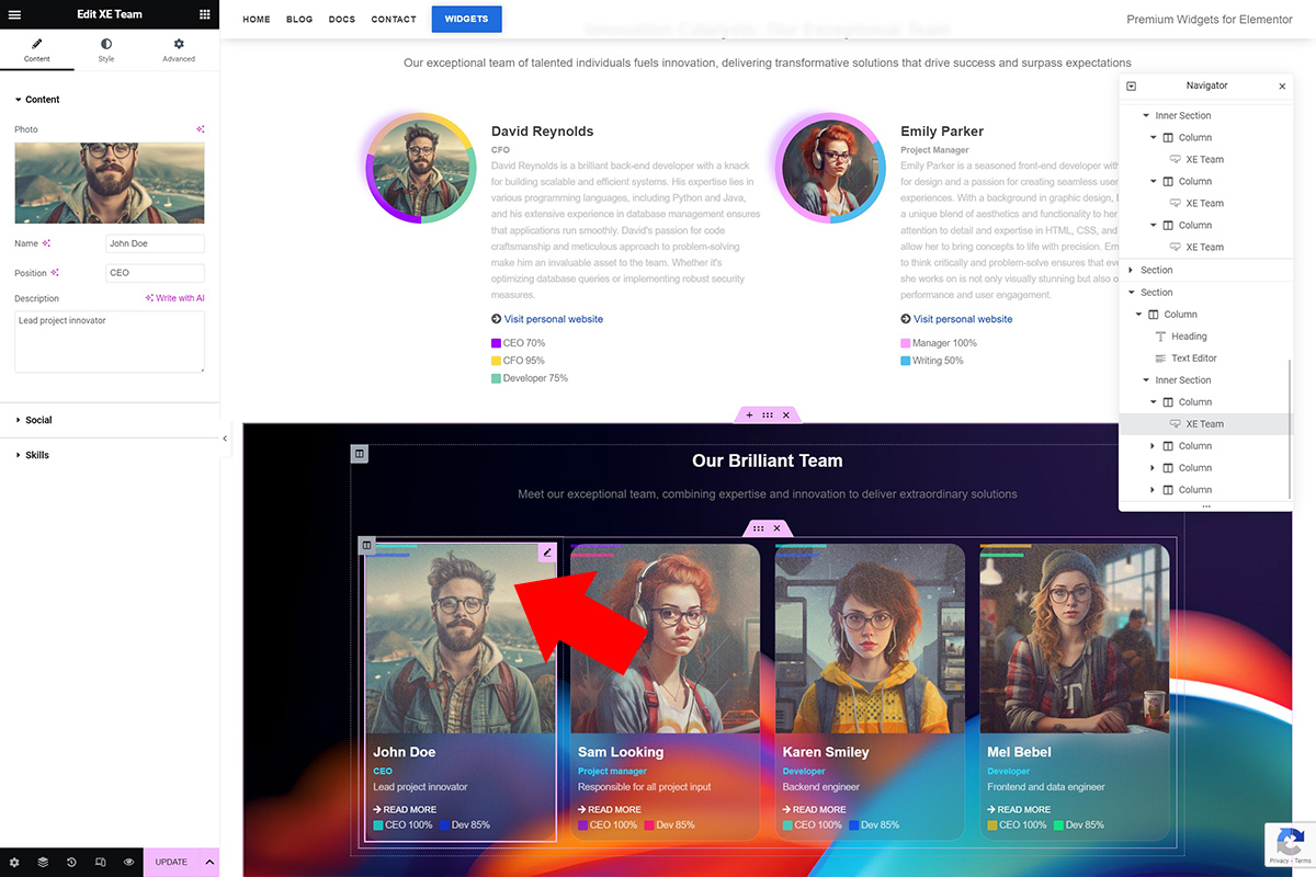
Image Wrapper
These style options control the img wrapper element.
Padding - Sets the paddings of the element.
Border - Sets the border options for the element.
Box shadow - Sets the box shadow options for the element.
Background - Sets the background options for the element.
Img
These style options control directly the img element.
Margin - Sets the margins of the element.
Padding - Sets the paddings of the element.
Border - Sets the border options for the element.
Box shadow - Sets the box shadow options for the element.
Background - Sets the background options for the element.
Max width - Sets the max width options of the image.
Content
Content sets the style options of the team member card content. This is the content that goes along side image or below depending on card direction.
Margin - Sets the margins of the element.
Padding - Sets the paddings of the element.
Border - Sets the border options for the element.
Box shadow - Sets the box shadow options for the element.
Background - Sets the background options for the element.
Texts
Text tab is about the texts. Name, Position and Description styles can be set here.
Name
Typography - Sets the typography options for this element.
Alignment - Sets the alignment options for this element.
Color - Sets the color for this element.
Margin - Sets the margins of the element.
Padding - Sets the paddings of the element.
Position
Typography - Sets the typography options for this element.
Alignment - Sets the alignment options for this element.
Color - Sets the color for this element.
Margin - Sets the margins of the element.
Padding - Sets the paddings of the element.
Desc
Typography - Sets the typography options for this element.
Alignment - Sets the alignment options for this element.
Color - Sets the color for this element.
Margin - Sets the margins of the element.
Padding - Sets the paddings of the element.
Social Netowrks
This tab controls the social network styles.
Show - Show or hide the social networks.
Text - If you set this to No only icons will show.
Social Layout
Direction - Sets the direction of this element. Use Column or Row.
Gap - Sets the gap.
Social Style
Typography - Sets the typography options for this element.
Margin - Sets the margins of the element.
Padding - Sets the paddings of the element.
Border - Sets the border options for the element.
Box shadow - Sets the box shadow options for the element.
Background - Sets the background options for the element.
Skills
This tab controls the Skills styles.
Show - Show or hide the skills text.
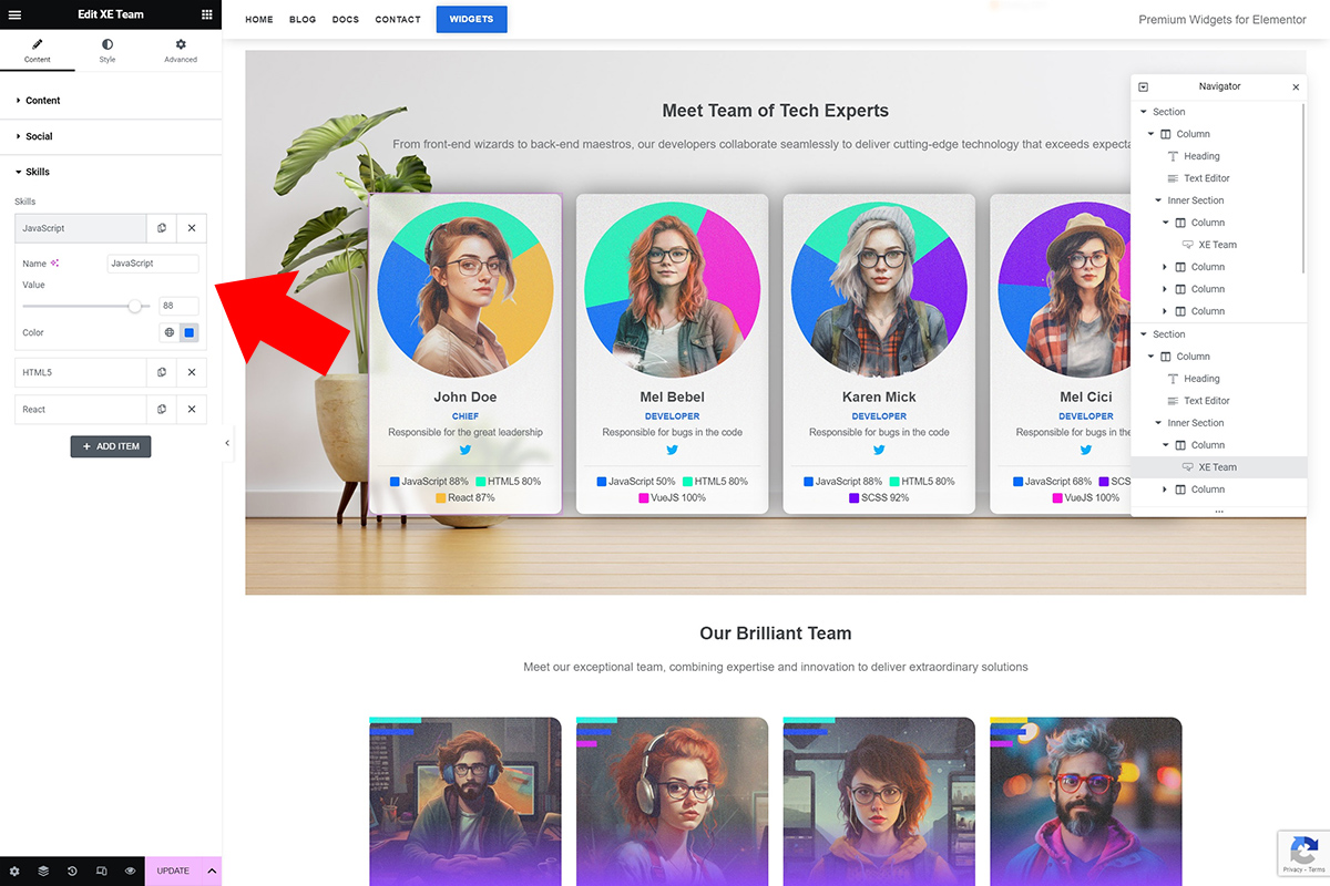
Type - Bars or Pie Charts or hide. Choose how to display the skills render.
Pie Chart - The Pie Chart is rendered behind the image. It is also round. If you use the Pie Chart make sure you add enough padding for the image wrapper in order to make it visible. Also if you use the Pie Chart option, it is advised to have a round team member image.
Bars - Bars go over the image and render skills. Bar size and Bar gap options are avialable to configure the chart.
The Pie Chart is rendered behind the image. It is also round. If you use the Pie Chart make sure you add enough padding for the image wrapper in order to make it visible. Also if you use the Pie Chart option, it is advised to have a round team member image.
Layout
Direction - Sets the direction of this element. Use Column or Row.
Gap - Sets the gap.
Style
Typography - Sets the typography options for this element.
Margin - Sets the margins of the element.
Padding - Sets the paddings of the element.
Border - Sets the border options for the element.
Box shadow - Sets the box shadow options for the element.
Background - Sets the background options for the element.